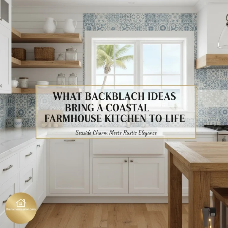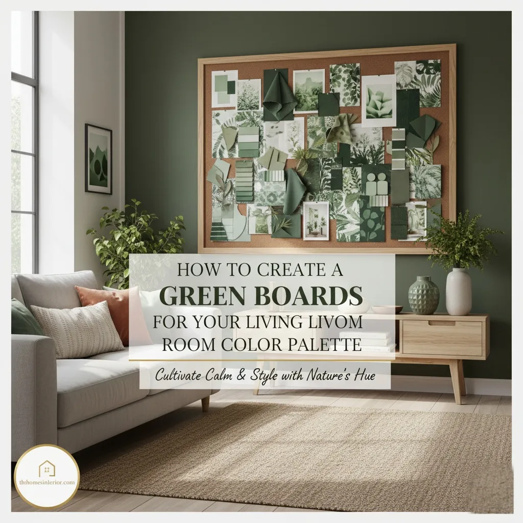
A client once told me, “I love green, but every time I try to use it, my living room ends up looking like a jungle or a hospital.” That’s the tricky part about decorating with green and it’s one of the most versatile colors in design, yet the hardest to balance. From soft sage to deep emerald, olive to mint, every shade creates a different mood and energy. Without a clear visual direction, your living room can easily lose its harmony.
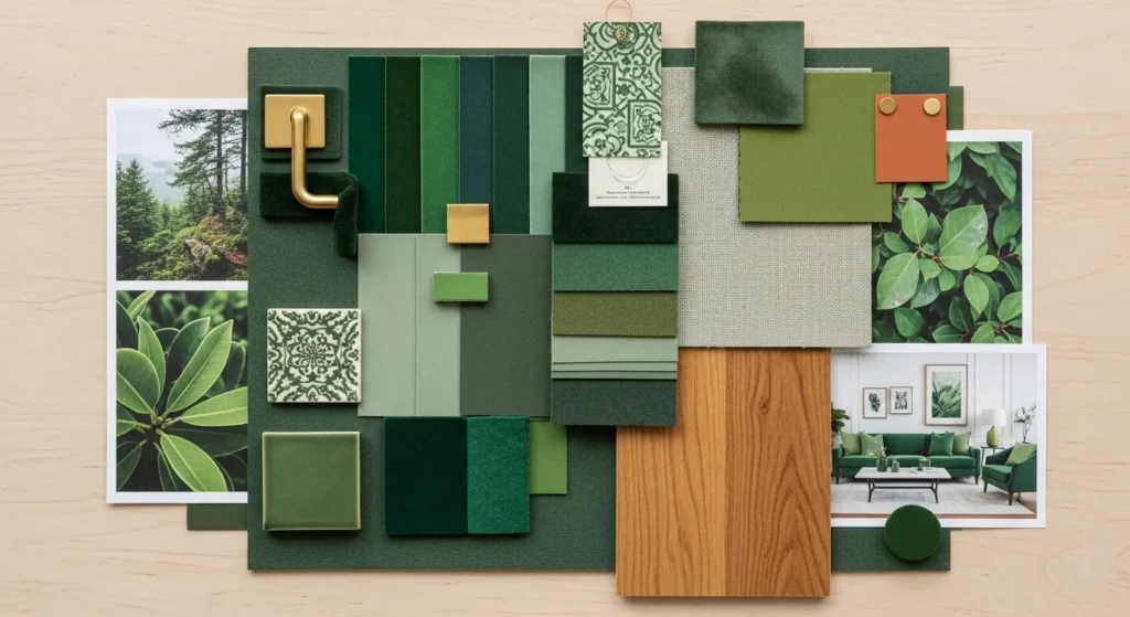
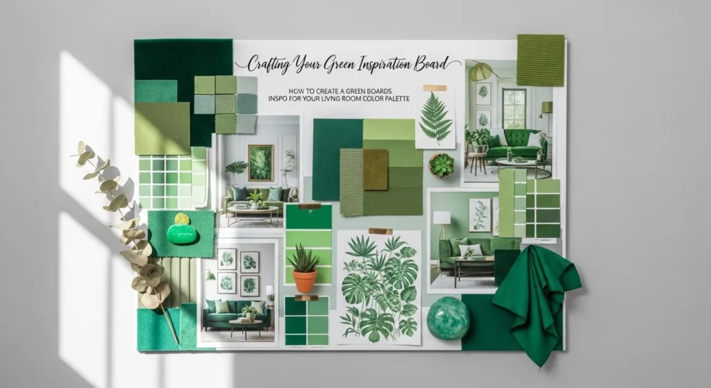
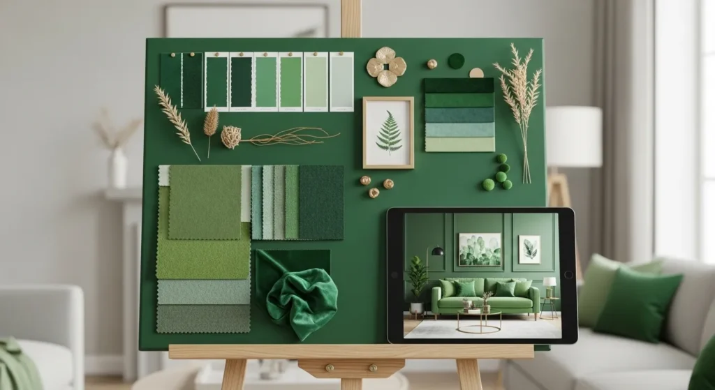
That’s where green boards inspo becomes your secret design weapon. A thoughtfully curated green inspiration board helps you experiment with tones, textures, and accent colors before committing. It’s more than just a collage and it’s a creative blueprint that helps you visualize how wall paint, furniture, and decor pieces interact. Whether you’re doing a full living room makeover or a small seasonal refresh, using a green boards inspo approach ensures your color palette feels intentional, cohesive, and effortlessly stylish.
Tools & Materials to Build Your Board
Here’s what you’ll need to create a green-focused inspiration board:
- Paint swatches (multiple green tones + neutrals)
- Fabric samples (linen, velvet, cotton blends)
- Magazine clippings or printed decor images
- Flooring or wood finish samples
- Accent color chips (gold, brass, terracotta, charcoal)
- Foam board or digital mood board platform
- Double-sided tape or pins for layering
- Natural elements (leaves, dried eucalyptus, moss)
Designer’s Note: If you’re going digital, use platforms like Canva or Pinterest. They allow easy drag-and-drop and color matching, perfect for testing combinations before buying anything.
Crafting Your Green Inspiration Board
Choose Your Anchor Green
Select a dominant green tone, sage, forest, olive, or emerald. This foundational choice sets the emotional tone and guides every supporting color, texture, and material you’ll layer into your living room palette.
Add Neutrals and Grounding Tones
Incorporate whites, creams, taupes, or soft greys. These hues balance green’s vibrancy, soften boldness, and create a livable, calming base that supports your chosen palette without competing for attention.
Layer in Texture
Use fabric swatches, wood samples, and natural elements. Texture adds warmth, depth, and visual interest, preventing your green palette from feeling flat or overly monochromatic. If you have a column in the living room, consider wrapping it in textured wallpaper or limewashed paint to integrate it into your palette and turn it into a subtle design feature.
Introduce Accent Colors
Add brass, terracotta, navy, or blush to your board. These accents complement green beautifully, adding contrast and personality without overpowering the overall harmony of your palette.
Test Lighting Impact
Observe your board in both natural and artificial light. Green tones shift dramatically with lighting, so testing ensures your palette feels consistent and inviting throughout the day.
Pro Tip: Always include a sample of your flooring or rug. It anchors the palette and ensures your greens harmonize with existing elements.
Why Green Works So Well in Living Rooms
Green is one of the most versatile colors in interior design. It evokes nature, calm, and renewal, making it ideal for living rooms where relaxation and connection happen. Whether you lean toward soft sage or bold emerald, green adapts to many styles and moods.
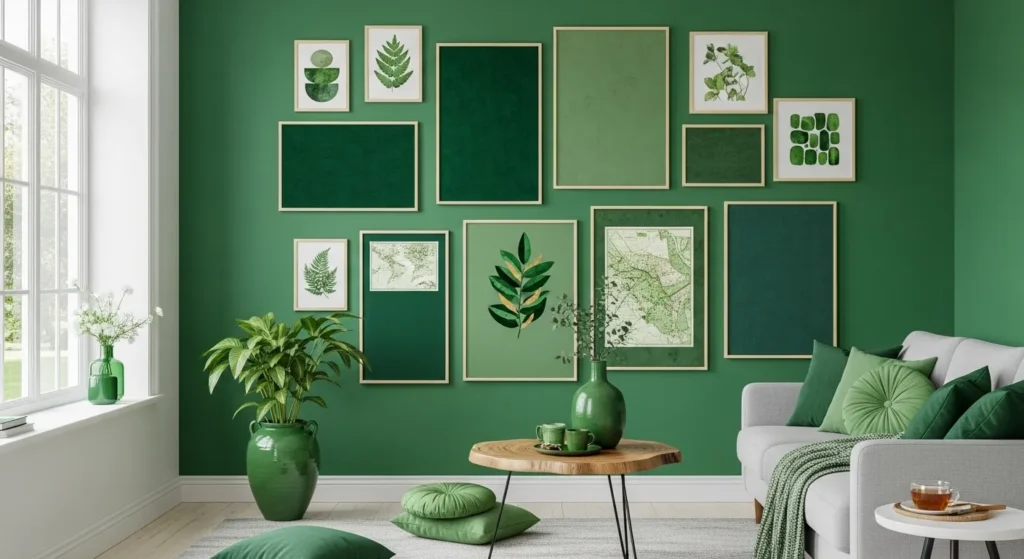
It also pairs beautifully with a wide range of materials. From rattan and linen to brass and marble, green complements both rustic and refined aesthetics. That flexibility makes it a smart choice for DIY decorators looking to build a cohesive palette with personality and warmth.
Understanding Green’s Emotional Range
Sage Green
Soft and calming, sage green pairs beautifully with warm woods and creamy whites. It evokes a sense of tranquility and works well in nature-inspired living rooms that prioritize comfort and subtle elegance.
Emerald Green
Bold and luxurious, emerald green adds drama and depth. It complements gold, velvet, and rich neutrals, making it ideal for statement pieces or accent walls in sophisticated, high-style living spaces.
Olive Green
Earthy and grounded, olive green blends seamlessly with terracotta, brass, and natural textures. It’s perfect for rustic, Mediterranean, or bohemian-inspired rooms that celebrate warmth and organic charm.
Mint Green
Fresh and airy, mint green suits light woods and pastel accents. It’s a great choice for Scandinavian or cottage-style interiors, offering a breezy, uplifting feel that keeps the space light and cheerful.
Forest Green
Deep and moody, forest green adds richness and intimacy. Pair it with leather, matte black, or aged brass to create a cozy, layered atmosphere that feels grounded and visually compelling.
How to Incorporate Your Board into Real Design Decisions
Once your board feels balanced, use it as a reference for every choice, paint, furniture, textiles, and decor. Take it shopping. Compare it against samples. It becomes your visual compass.
Start with walls or large furniture pieces. Then layer in textiles, curtains, cushions, throws. Use accent colors sparingly but intentionally. Let your board guide proportions: if 60% is green, reflect that in your room’s layout.
Designer’s Note: Don’t match everything perfectly. Variation in tone and texture keeps the space dynamic. A velvet emerald sofa next to a sage-painted wall creates contrast and depth.
Common Mistakes to Avoid When Building Your Board
One of the biggest missteps is choosing too many greens without considering undertones. Cool and warm greens can clash if not balanced with neutrals or texture. Always test combinations before committing to paint or fabric.
Another mistake is ignoring lighting. A green that looks perfect in daylight may feel heavy under artificial light. Use samples and test in multiple conditions. And don’t forget scale, tiny swatches can mislead. Try larger samples to get a true sense of how the color will look in your space.
Frequently Asked Questions
Can I mix multiple shades of green?
Yes, but vary the undertones and textures. Pair warm olive with cool mint or deep forest with soft sage for balance.
What neutral works best with green?
Cream, taupe, and soft grey are ideal. They soften green’s intensity and create a calming backdrop.
Should I include patterns on my board?
Absolutely. Add a floral, stripe, or abstract print to test how green behaves in pattern. It adds personality and movement.
How do I know if my green is too bold?
Test it in different lighting. If it feels harsh or overwhelming, tone it down with matte finishes or softer accents.
From Mood Board to Mood Maker: Let Green Lead
Here’s what matters most:
- Choose one anchor green and build around it
- Layer in neutrals, textures, and accents
- Test your board in varied lighting
- Use it as a guide for every design decision
Creating a green boards inspo isn’t just about color, it’s about clarity. It helps you visualize your living room’s potential, avoid costly mistakes, and design with confidence. Whether you’re painting walls or styling shelves, your board becomes your blueprint for beauty.
What green shade speaks to you most? Share your favorite combinations in the comments; we’d love to see how you’ve brought green to life.